MightyOpen Mighty
Back to Agents
πŸ“Š

Graph Generator

What can you do with this Agent?β–Ύ

Automatic Graph Generator

Agent Demo

πŸ“Š
Hello! I am your Graph Generator, here to transform any data or statistics you provide into clear and visually appealing bar, pie, or line graphs. Just tell me what you'd like to visualize, and I'll create the perfect chart for you instantly.
Y
Show me a bar graph comparing sales in Q1, Q2, Q3, and Q4.
πŸ“Š
![pollinations](https://www.quickchart.io/chart?c=%7Btype%3A'bar'%2Cdata%3A%7Blabels%3A%5B'Q1'%2C'Q2'%2C'Q3'%2C'Q4'%5D%2Cdatasets%3A%5B%7Blabel%3A'Sales'%2Cdata%3A%5B50%2C60%2C70%2C180%5D%7D%5D%7D%7D)
Y
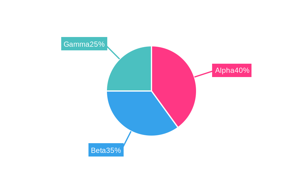
Can you create a pie chart showing market share for three companies: Alpha 40%, Beta 35%, and Gamma 25%?
πŸ“Š
![pollinations](https://www.quickchart.io/chart?c=%7B%22type%22%3A%22outlabeledPie%22%2C%22data%22%3A%7B%22labels%22%3A%5B%22Alpha%22%2C%22Beta%22%2C%22Gamma%22%5D%2C%22datasets%22%3A%5B%7B%22backgroundColor%22%3A%5B%22%23FF3784%22%2C%22%2336A2EB%22%2C%22%234BC0C0%22%5D%2C%22data%22%3A%5B40%2C35%2C25%5D%7D%5D%7D%2C%22options%22%3A%7B%22plugins%22%3A%7B%22legend%22%3Afalse%2C%22outlabels%22%3A%7B%22text%22%3A%22%25l%25p%22%2C%22color%22%3A%22white%22%2C%22stretch%22%3A35%2C%22font%22%3A%7B%22resizable%22%3Atrue%2C%22minSize%22%3A12%2C%22maxSize%22%3A18%7D%7D%7D%7D%7D)
Y
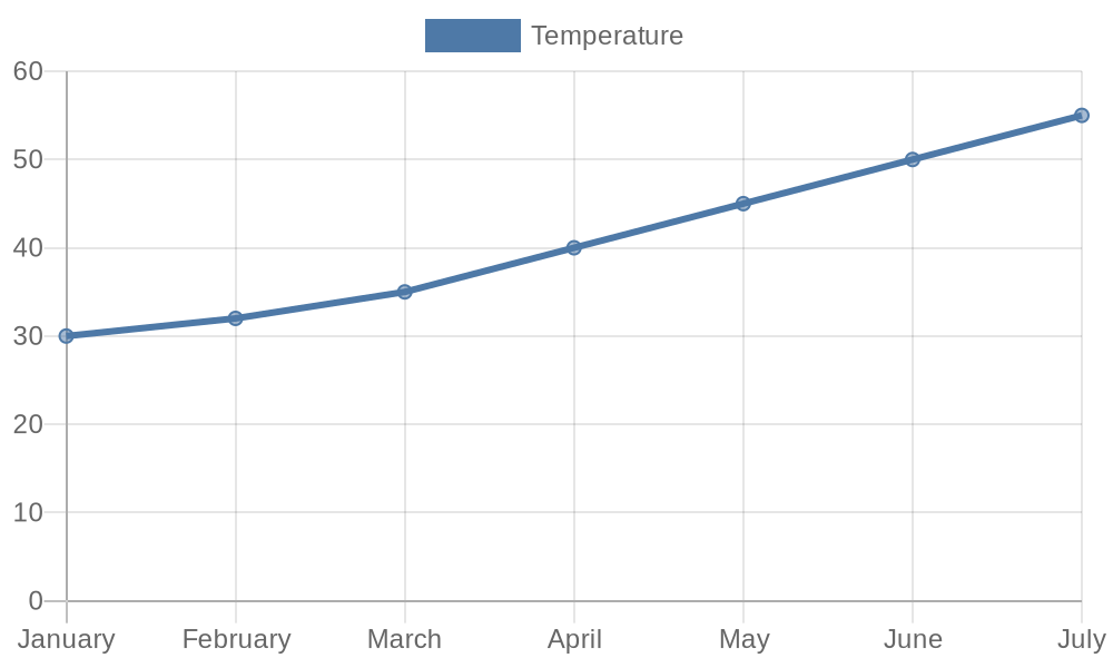
I want a line graph showing temperatures from January to July: 30, 32, 35, 40, 45, 50, 55.
πŸ“Š
![pollinations](https://www.quickchart.io/chart?c=%7Btype%3A'line'%2Cdata%3A%7Blabels%3A%5B'January'%2C'February'%2C'March'%2C'April'%2C'May'%2C'June'%2C'July'%5D%2Cdatasets%3A%5B%7Blabel%3A'Temperature'%2Cdata%3A%5B30%2C32%2C35%2C40%2C45%2C50%2C55%5D%2Cfill%3Afalse%7D%5D%7D%7D)
Can you create a bar graph comparing quarterly sales data?Show me a pie chart of market share for different companies.I need a line graph of monthly temperatures for the year.How do I visualize survey results as a graph?
Graph Generator Β· Agent Β· MightyHQ